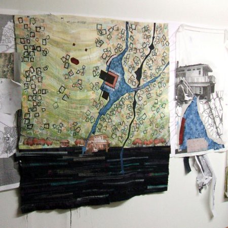
A few days ago I mentioned my concern that this center panel was possibly suffering from imbalance. Well I am in the process of creating a more balanced composition by adding elements to the left side. The tree pattern on this side of the site seemed to be more organized than that on the right. This observation caused me to treat the "tree tops" as a related - yet different set of elements.
You may not be able to see this in this photo but I chose to:
- Use a darker shade of green.
- Arrange theses elements in a more organized fashion.
My goal is to use some of the basic ways creating balance:
color, pattern, position.Also you may notice that I have begun to work on panel #3...........


I really like the way you layer the colors and textures. i remember you said that the shadows under the trees were sheers, and now we've seen that teh background is pieced. I wonder if the trees are painted, or are opaque fabrics sewn or fused on? (To be able to see wonderful details like this is definitely where seeing a piece in person is so much better than online or in a catalog! There's no substitute for being there.)
ReplyDelete